

Creating a childrens book that kids love is an art. Professional printing is key in this process. It turns stories into vibrant tales, especially those about Australian animals or with interactive features.
In children’s books, looks are everything. Professional printing makes sure the pictures stand out brilliantly. Kids get hooked and use their imaginations more, which is crucial for picture books. Here, the illustrations speak almost as loudly as the words do.
Though digital books have their charm, physical books offer something more. They give kids a hands-on experience with their beautiful paper and bright colours. Having a well-printed book means it lasts longer and is more fun to read. Professional printing can elevate these features, making your book catch eyes on bookshelves.
If you’re an author going the self-publishing route, investing in good printing is smart. It shows you value quality. This can win over young readers, parents, and teachers. No matter if your story is about the outback or a magical city, professional printing can leave a big and memorable mark.
Understanding the Importance of Professional Printing for a Childrens Book
Professional printing is key for making children’s books that are both attractive and durable. It makes a big difference in how kids relate to stories. Good print quality helps in creating a positive first step towards a lifelong love of reading.
Impact on reader engagement
Great printing draws young eyes to the page. Bright colors and clear pictures keep children interested. Illustrations done in watercolors add a special touch and make stories come alive.
Using high-quality paper like 128gsm coated art paper makes images look sharp. It also holds children’s interest longer.
Quality perception by parents and educators
Parents and teachers see the value in well-printed books. A visually appealing cover can make a book 40% more likely to be chosen. It shows that good printing and design are vital for a book’s success.
- Offset printing is preferred for premium children’s books
- Landscape layouts in sizes such as 11 x 8.5 or 12 x 9 inches are visually appealing
- Bright, warm colours like magenta and turquoise create an inviting atmosphere
Long-term durability considerations
Children’s books need to last through a lot of use. Good printing on quality materials makes this possible. Case binding protects hardcover books well. This keeps books looking good even after lots of readings.
| Printing Method | Advantages | Best Use |
|---|---|---|
| Offset Printing | High quality, vibrant colours, sharp text | Large print runs, premium books |
| Digital Printing | Cost-effective, quick turnaround | Small print runs, self-publishing |
Knowing about professional printing helps authors and publishers. It guides them in making children’s books that are not only engaging but also long-lasting. This adds to the wonderful world of children’s literature.
Choosing the Right Paper for Your Childrens Book

Choosing the right paper for your children’s book is key. It impacts the look and feel of the book. Quality paper makes the book more durable and visually appealing.
Paper Types and Their Characteristics
Children’s books mainly use three paper types inside:
- Gloss coated art paper
- Matte coated art paper
- Offset (uncoated) paper
Gloss coated art paper highlights bright illustrations well. Think about a softcover book. It might use 200 gsm gloss art paper for the best look and feel.
Balancing Cost and Quality
The type of paper you choose affects cost. Glossy paper is more expensive than simple paper. Think about your book’s needs and what you can afford. For a 20-page colouring book, 140 gsm offset paper is a wallet-friendly choice.
| Book Type | Recommended Paper | Weight (gsm) |
|---|---|---|
| Colouring Book (20 pages) | Offset | 140 |
| Illustrated Book (28 pages) | Gloss Art | 200 |
| Hardcover (32-48 pages) | Coated | 157 |
Environmental Considerations

Green printing is more popular now in making children’s books. Many use recycled paper for the pages. This helps the environment and saves money. Large publishers like Penguin and Scholastic often choose recycled paper for their bigger books.
“Choosing the right paper is about finding the perfect balance between visual appeal, durability, cost, and environmental impact.”
Thinking about paper carefully means a more engaging book for kids. It also meets production needs and helps the planet.
Childrens Book Binding Options for Lasting Appeal
Choosing the right book binding method is key for your children’s book. It affects how long it lasts and looks, influencing the reading experience. We’ll look at common binding styles to help your book grab attention on shelves.
Saddle Stitching: Simple and Cost-Effective
Saddle stitching is ideal for small books, like:
- Booklets
- Brochures
- Catalogues
- Programs
It works best for books with up to 48 pages. The process is fast, cheap, and leaves a tidy edge.
Perfect Binding: For Thicker Books
For books over 96 pages, perfect binding is a great choice. It gives a square spine with a strong glue. This is good for:
- Paperbacks
- Corporate reports
- Refined catalogues
It can bind 18,000 units an hour, perfect for big projects.
Hardcover Books: Premium Protection
Hardcover books are top for protecting your story, and they look premium. They’re perfect for children’s books as they:
- Guard against wear and tear
- Create a sense of value
- Encourage ownership in young readers
Though more expensive, they last longer, justifying the cost.
Spiral Binding: Kid-Friendly Option
Spiral binding works well for children’s cookbooks and colouring books. It has benefits like:
- Flat-opening pages
- Easy page-turning
- Durability for frequent use
Great for keeping books open while kids use them.
| Binding Method | Page Count | Best For |
|---|---|---|
| Saddle Stitching | Up to 48 | Small booklets |
| Perfect Binding | Over 96 | Thick publications |
| Hardcover | Any | Premium books |
| Spiral | Any | Interactive books |
Choosing the right binding affects how your book is received. Think about what your book is about, how much you can spend, and who you’re making it for. With the right choice, your children’s book will not only grab attention but also last a long time.
Colour Printing Techniques to Bring Childrens Book Illustrations to Life
Colour printing brings children’s book illustrations to life. It helps capture the young readers’ attention and makes the story more engaging. We will look at the methods that make illustrations leap off the page.
CMYK vs RGB Colour Models
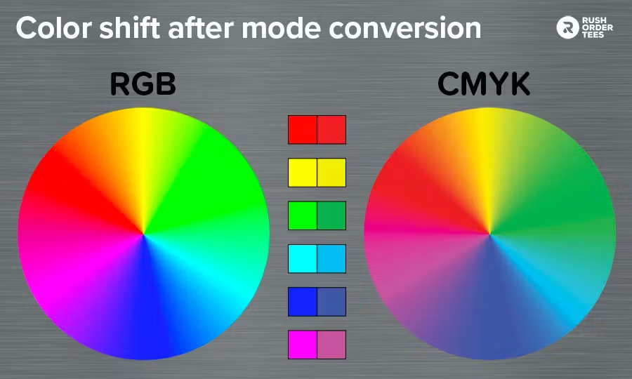
There are two key colour models in the publishing world, CMYK and RGB. CMYK, which means Cyan, Magenta, Yellow, and Key (Black), is best for print. RGB, made of Red, Green, and Blue, is for screens. Children’s books most often use CMYK for its printable colour range.
Spot Colour Printing for Vibrant Childrens Book Results
Spot colour printing creates bold, unique colours unlike the standard four-colour process. It’s ideal for illustrations that demand attention. This method is great for showcasing brand colours or achieving exact shades not possible with CMYK.
Colour Calibration and Proofing
Colour calibration ensures the colours on your screen match the prints. This is key for keeping your illustrations true to form. Proofing allows you to correct colours before print, making sure they are vivid and precise.
Consider these points for choosing colours in children’s books:
- Bright colours are more appealing to children
- Neutrals like black, white, and gray are less eye-catching
- Dark colours with bright accents can set a more serious tone
- Consistent colour palettes create recognition among kids
Jean Charlot, a well-known children’s book illustrator, took a unique colour printing approach. Despite the use of four-colour printing, he preferred solid colours and line techniques. In his book “Tito’s Hats,” he made colour a vital part of the illustrations, choosing brown and yellow as the main colours.
“Colour is not just about making things pretty. It’s about conveying emotion, setting the tone, and bringing the story to life.”
Learning about colour printing techniques helps create illustrations that are not only good-looking but also connect with young readers. This can make your children’s book really stand out.
Enhancing Your Childrens Book with Special Printing Effects
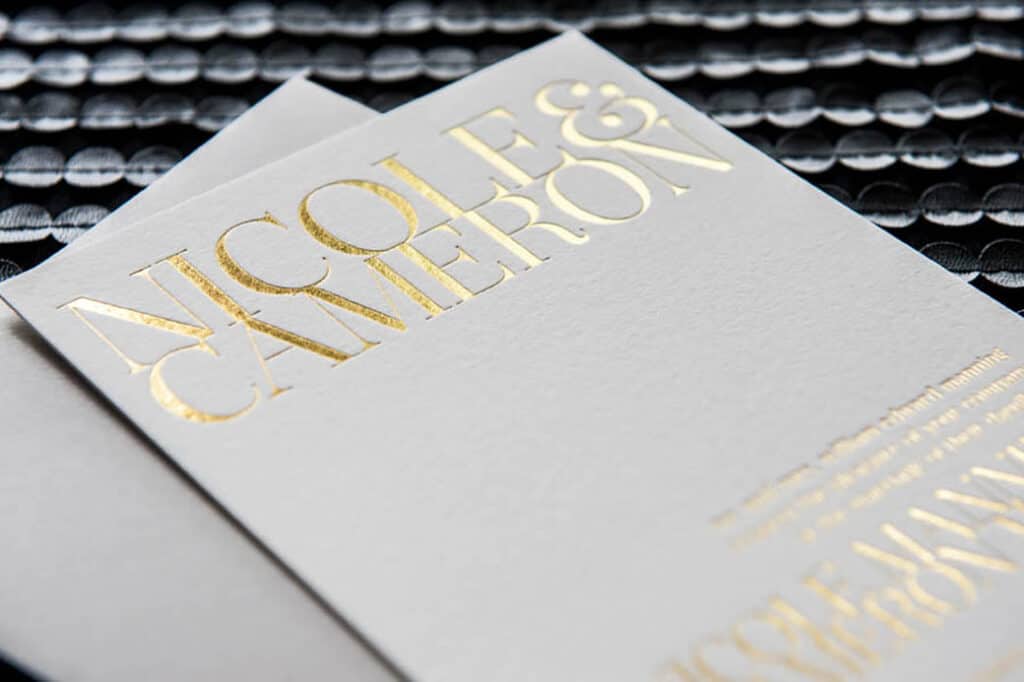
Special effects printing can make your children’s book really stand out. They add something special that young readers love.
Foil stamping is like adding a magic touch to your covers. It puts shiny foil on designs, making them eye-catching. Think of a dragon’s golden scales or a fairy’s silver wings. It instantly draws kids into the adventure.
Embossing makes elements stand up off the page. Kids enjoy feeling these designs, adding to their fun. For a lavish touch, combine it with foil stamping.
Spot UV coating is a neat trick. It makes certain parts shine more than others. This can draw attention to important parts of your book.
- Foil stamping: Adds metallic shine
- Embossing: Creates raised, touchable designs
- Spot UV coating: Highlights specific areas with gloss
Yes, these effects might cost more. But, they make your book feel more valuable. According to Formax, books with these effects can sell for more. So, it’s often worth it.
But, don’t overdo it. Too much can be too busy for kids. Pick strategies that really bring your story to life. That way, your book can be special without being overwhelming.
Selecting the Ideal Childrens Book Size and Format
Choosing the right size and format for your children’s book is key. The perfect mix helps kids read with joy. It makes the story look great too.
Standard sizes for different age groups
Books for kids come in many sizes for each age group and type. Here are some common sizes:
- Picture books: 210 x 297mm, 148 x 210mm, 148 x 148mm and 210 x 210mm
- Early readers: 148 x210mm
- Chapter books: 127 x 210mm
- Middle-grade books: 127 x 190mm
Landscape vs portrait orientation
Choosing between landscape and portrait depends on your tale and pictures. Picture books like 210 x 297mm or 148 x 210mm are often in landscape. They’re great for wide scenes or action shots. Portrait formats fit well for more words or tall images.
| Orientation | Advantages | Best for |
|---|---|---|
| Landscape | Wide spreads, easy handling | Picture books, action scenes |
| Portrait | Familiar format, space-efficient | Text-heavy books, vertical illustrations |
Designing for readability and visual appeal
If you want your book to be both pretty and easy to read:
- Use big fonts for the young ones
- Give plenty of white space for a breath
- Make sure text and pictures jive together well
- Pick a size that matches your content and readers
Size matters for printing costs. Common sizes are cheap, especially for small batches. A5 (210x148mm) is a good budget option.
“The right book size and format can make your children’s book stand out on the shelf and in the hands of young readers.”
Professional Cover Design: Making a Strong First Impression

A book cover is essential in grabbing people’s attention, especially kids. It’s the first glimpse they get of a book. Studies say almost everyone judges a book this way, underlining the cover’s role in drawing readers in.
Having a great design can impact a book’s popularity. Research shows that appealing covers can increase the chance of being picked by 40%. This highlights the need for your cover to attract both in stores and online.
Key elements for a children’s book cover design include:
- Age-appropriate design: Make sure it matches the right age
- Vibrant colours: Bold and bright colours catch young eyes
- Clear typography: The title should be easy to read
- Engaging illustrations: You can use characters or animals kids love
- Emotional appeal: Reflect the book’s mood and message
Did you know, 61% of kids’ books are bought by adults, mostly women aged 18-44? So, your cover must catch both kids’ and parents’ eyes. It should tell the story inside in a captivating way.
Working with skilled illustrators can bring your cover to life. They can understand your book’s core and appeal to your intended audience. An enticing cover not only hooks readers but also gives them a taste of what to expect.
In today’s quick book buying, your cover must do its job fast. Within 3 seconds, it should share what your book is about. This rule is crucial for digital images too. A design that’s clear and attractive will help your book shine in a crowded market.
Interior Layout and Typography Considerations
The layout inside a children’s book is very important for young readers. It mixes cool fonts and fun pictures. This makes reading a smooth and exciting journey for kids.
Font Selection for Young Readers
Picking the perfect font matters a lot. For books aimed at younger kids, choose fonts that are 16 to 24 points. Go for sans-serif fonts because they look clean and simple. Here’s a handy font size guide:
- Picture books: 18-24 points
- Early readers: 16-18 points
- Chapter books: 12-14 points
Balancing Text and Illustrations
Finding the right mix of text and pictures is essential to keep kids interested. Picture books typically have 200 to 400 words, about 15 to 30 words for each page. This leaves lots of space for eye-catching illustrations, making them central to the story.
| Book Type | Word Count | Words per Page |
|---|---|---|
| Picture Book | 200-400 | 15-30 |
| Early Reader | 400-800 | 30-50 |
| Chapter Book | 1,000-5,000 | 50-100 |
Creating a Visually Pleasing Flow
The look of the book should pull readers into the story. Here are some tips to do this well:
- Use page turns to create surprise or tension
- Vary text placement to complement illustrations
- Create storyboards to map out page order
- Leave white space for visual breathing room
Keeping young readers hooked starts with good design. Make sure to think about the fonts, how the text and pictures work together, and making sure the book flows well. These steps help create a book that’s not just fun to read but also looks amazing.
“The right balance of text and images can turn a good children’s book into a great one, captivating young readers and sparking their imagination.”
Printing Techniques for Interactive Elements
Interactive books keep young readers hooked with fun features. These include great introduction, pop-ups, lift-the-flaps, and textures. They make the reading experience interactive and exciting.
Pop-ups make the story jump off the page. They are complex and need precision. Printers cut them with special machines. Then, they’re folded and glued, turning the page into a 3D scene.
Lift-the-flaps make the book a surprise adventure. Each book has hidden flaps to discover. They must be strong to last through many reads.
Books with textures offer a touchable experience. Printers add textures in different ways:
- Embossing: This creates raised patterns.
- Spot UV: It makes certain areas shiny and smooth.
- Flocking: This adds a soft, fuzzy feel.
Here are some printing tips for making interactive books:
- Pick strong paper to endure lots of touching.
- Choose board books for the littlest readers.
- Use easy-to-read fonts like Cool Crayon.
- Make sure pictures are high quality at 300 DPI.
Interactive elements are great for kids’ books. They make learning fun and aid in development. Working with skilled printers helps authors make books that kids love and remember.
“Interactive books turn reading into a magical journey of discovery, sparking imagination and nurturing a lifelong love of stories.”
Quality Control in the Childrens Book Printing Process
Quality control is crucial when printing children’s books. It makes sure your book is top-notch. This delights young readers. We will look at the main stages of quality control in printing.
Proofing and Approval Stages
Proofing is very important. It helps find mistakes before printing starts big. Correcting errors at the blueprint stage saves a lot of money. Be sure to check proofs well.
- Review text for typos and grammar
- Check illustration placement and quality
- Verify page numbers and layout
Colour Matching and Consistency for your Childrens Book
Maintaining vibrant colours is crucial for children’s books. It helps your illustrations look their best. Making sure all copies match in print is just as important.
RGB colours are used in digital printing; CMYK in lithographic. For big print runs, lithographic printing often offers better quality.
Final Quality Checks
Just before your book is sold, it undergoes final checks. Every printed detail is carefully examined.
| Quality Check | What to Look For |
|---|---|
| Print Quality | Clear text, vivid colours, no smudges |
| Binding | Secure pages, even margins |
| Cover | Smooth finish, correct title and author name |
| Page Count | All pages present and in order |
Quality control is key at every printing stage. This guarantees your final product is top quality. Focusing on proofing, colour consistency, and final checks ensures your children’s book shines.
Cost-Effective Childrens Book Printing Strategies for Self-Published Authors
In Melbourne, self-publishing is booming thanks to digital options and online selling points. For self-publishing authors, picking the right print method is key. This ensures both success and smart money management.
Digital printing is a great choice for self-publishers. It’s good for small runs, quick to print, and costs less up front. Perfect for authors dipping their toes in or those with budget constraints.
Print-on-demand has changed the game for self-publishers. It lets authors print their books as needed. This cuts down on keeping stock and lowers the upfront cost. A wise pick if you’re not sure how many books will sell.
If you need a lot of copies, offset printing is better value. The start-up cost is higher, but the cost per book goes down with more printed. It gives top-notch quality, ideal for books with lots of colourful pictures, like children’s books.
| Printing Method | Advantages | Best For |
|---|---|---|
| Digital Printing | Low upfront costs, quick turnaround | Small print runs, testing market |
| Print-on-Demand | No inventory, minimal risk | New authors, uncertain demand |
| Offset Printing | Lower per-unit cost, high quality | Large print runs, established authors |
When picking a print method, look at quality, price, and service. In Melbourne, local printers give personal care, and big national printers offer scale benefits with speedy results.
Don’t forget, self-publishing childrens books can cost from $1,500 to $6,000. This includes artwork, formatting, editing, and printing. It’s all about balancing these costs with your printing method for the best outcome.
Childrens Book Professional Printing – A Conclusion
Professional children’s book printing is key to making wonderful adventures and stories stick with young readers. The way a book looks and feels affects how kids engage with its story. Choosing the best paper, binding, and colours is vital for a book’s success.
Authors and publishers benefit greatly from high-quality printing. It helps their books shine in a crowded field. Good printing isn’t just about looks; it’s also about clever design and interactive features. Plus, it promises top quality for both children and those who guide them.
In the children’s book world, top-notch printing is a game-changer. It enhances the joy of reading, boosts a book’s worth, and helps it do well long term. From writing a story to seeing it in print, the process isn’t simple. However, the impact of doing it right on both young minds and success is huge.