

In the realm of print magazines, the art of creation is akin to a tightrope act. Designers must harmoniously blend visual appeal with practicality. This balance between aesthetics and functionality has sparked intense discussions for years.
The Centre for Universal Design Australia underscores the importance of both tangible and intangible qualities in design. In magazine printing, designers combine elements such as scale, pattern, colour, and texture. They also ensure the design meets user needs and fulfills specific goals.
Print magazines transcend mere visual pleasure. They represent a fusion of art and science, where every element influences the reader’s experience. From the choice of paper to typography, each decision is vital in striking a design balance that engages and educates.
In Australia, magazine printers offer swift turnaround times, from same-day to 5-day printing. This flexibility enables the creation of visually captivating and functionally effective print magazines. They meet the varied preferences and publishing requirements of readers.
The Art and Science of Magazine Design
Magazine design combines creativity with technical expertise to produce visually appealing and functional print media. It requires a careful balance of aesthetics and practicality. This approach ensures engaging publications that capture readers’ attention.
Understanding the Visual Appeal
Visual appeal in magazine design transcends mere beauty. It’s about making a lasting impression on readers. The strategic use of color schemes, typography, and imagery plays a crucial role in a magazine’s success. For example, bold typography and dynamic layouts are now more popular thanks to printing technology advancements.
Functionality in Print Media
Print media functionality is all about readability and easy navigation. Elliot Jay Stocks, a former creative director at Adobe Typekit, stresses the need to avoid faux styles in typography. This approach ensures clarity and improves the reader’s experience. It’s essential to balance design elements for both visual appeal and practicality.
The Delicate Balance
Striking a design balance in magazines is vital. It involves considering both aesthetics and functionality. This balance evolves with design trends and technology. A study by the Design Management Institute showed that design-driven companies outperformed others in revenue and shareholder returns. This underscores the significance of achieving this balance.
Balance distinction & harmony” – This principle can change the way graphic designers view and compose their work.
Magazine design is a complex art that requires a collection of creativity, technical skills, and an understanding of what readers prefer. By balancing visual appeal with functionality, designers can create magazines that truly engage and captivate readers.
Elements of Aesthetic Magazine Design
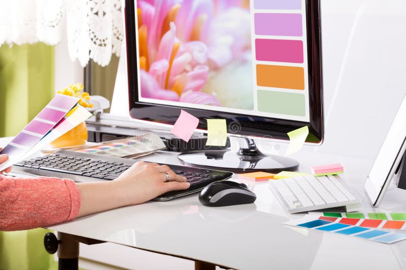
Aesthetic design is vital for creating visually striking magazine layouts. The way visual elements are arranged on each page is crucial. It ensures a design that grabs the reader’s attention. Typography, imagery, and colour schemes form the core of an engaging layout.
Grid systems are fundamental in aesthetic magazine design. They establish balance and a clear visual hierarchy, guiding the reader’s gaze through the content. In 2023, design trends lean towards clean layouts with plenty of white space. This approach ensures readability and visual appeal.
Images play a dual role in magazine design. They clarify concepts and evoke emotions, and they also break up the text. Currently, oversized photography is trending, creating impactful visuals that draw attention and tell strong stories. Custom illustrations are also on the rise, adding a distinctive flair to magazine visuals.
Bold typography is a key element in magazine design in 2023, with designers opting for daring fonts to add visual impact while maintaining legibility and coherence.
Colour schemes are crucial for engaging readers. Bright colour palettes are now preferred over muted ones, enhancing storytelling and stirring emotions. When choosing colours, it’s essential to balance aesthetics with readability for the best reading experience.
- Use dynamic grids for visually stimulating compositions
- Incorporate sustainable design elements
- Experiment with asymmetrical layouts
- Utilise white space effectively
By combining these elements skillfully, designers can craft magazine layouts that are not only visually appealing but also effectively convey the content to readers.
Functional Aspects of Magazine Prints
Magazine prints combine artistic flair with functionality. The practical elements of a print magazine are key to improving the reader’s experience and making content accessible.
Readability and Typography
Typography is essential for magazine readability. The choice of font, its size, and spacing affect how easily it can be read. Research indicates that 90% of information our brains process is visual, highlighting the need for clear, readable text.
Navigation and Layout
Layout navigation helps readers navigate through the magazine’s content. A well-designed layout makes it easy to consume a lot of information. Elements like spacing, colour, and graphics work together, following Gestalt psychology principles.
- Titles and headlines
- Images and captions
- Subheadings
These elements together create an engaging reading experience, encouraging readers to delve into the entire publication.
Paper Quality and Durability of Magazine Prints
Paper quality affects the tactile experience and lifespan of print magazines. The type of paper used impacts the magazine’s feel and durability. Important factors include:
- Paper weight
- Texture
- Finish
High-quality paper boosts the magazine’s visual appeal and ensures it lasts longer. It’s crucial for making a lasting impression on readers.
“The layout of a magazine plays a crucial role in engaging readers and motivating them to read through the entire publication.”
By focusing on these aspects, magazine prints can achieve a balance between beauty and utility, offering a fulfilling and memorable reading experience.
The Role of Cover Design in Magazine Prints
Magazine cover design is essential for grabbing reader attention. A compelling front cover not only makes a visual impact but also enhances cover appeal. Indeed, 90% of professional designers believe an eye-catching cover is crucial for drawing readers in today’s digital age.
Effective magazine cover designs incorporate several key elements:
- A prominent masthead
- An engaging main image
- A captivating lead article
- Supporting cover lines
- A discreet bar code
Designers advise placing the masthead centrally with a bold font to ensure it stands out. High-quality images are paramount, with 75% of designers highlighting their role in piquing subscriber interest.
Cover lines should be clear and concise, enhancing readability while offering a glimpse into the magazine’s content. A unique font style for the lead article title can capture readers’ attention, with 80% of designers advocating this strategy.
“A well-designed cover is your magazine’s best salesperson. It should entice, inform, and reflect your brand identity all at once.
Consistency in design elements across issues is key to establishing brand recognition. This includes maintaining consistent masthead, font sizes, and colour schemes. Bright neon colours can signal excitement, while contrasting colours help headings stand out against background images.
Special finishes like Spot UV can add a premium touch to the cover’s aesthetics and tactile feel. Paper weight between 250-350gsm ensures durability and a high-quality feel, protecting the inner pages and enhancing the overall magazine quality.
Colour Schemes and Their Impact on Reader Engagement
Colour is vital in print media, influencing how readers perceive and engage with magazine content. The right colour scheme can significantly enhance engagement and create a memorable impact.
Psychology of Colour in Print Media
Colour psychology affects reader emotions and actions. Warm colours like reds and oranges stimulate energy and passion. On the other hand, cool colours such as blues and greens foster calmness and trust. MVP Print leverages these colour psychology insights to enrich the reader’s experience.
Balancing Colour for Aesthetics and Readability
It’s essential to balance visual appeal with readability. Bold colours can capture attention but might reduce text clarity. Conversely, soft hues enhance readability but may lack the initial impact. Selecting the right print media colours is crucial for both aesthetics and functionality.
“Up to 90% of snap judgments about products are based on colour alone.”
This statistic underlines the significance of colour in print media. It emphasizes the importance of a thoughtful approach to colour in magazine design.
MVP Print’s Approach to Colour Selection
MVP Print adopts a strategic colour selection process. We consider:
- Brand identity and message
- Target audience preferences
- Cultural colour associations
- Print material type (e.g., magazines, brochures)
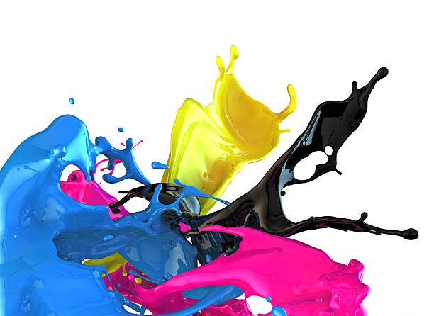
Our aim is to craft visually appealing designs that are also highly readable. We utilise the CMYK colour model, ideal for print, to ensure your magazine not only looks striking but effectively communicates your message.
Magazine Prints: Binding Options and Their Influence
Magazine binding is vital for the overall appearance and feel of a publication. The correct binding option can improve the print’s durability and the reader’s experience. Let’s delve into some popular binding options and their effects on magazine prints.
Perfect binding is a leading choice for magazines with more than 30 pages. This technique produces a flat spine, allowing for extra design elements. Although more expensive than other methods, perfect binding elevates the publication’s value and style.
For smaller magazines, saddle stitching is a preferred choice. It’s perfect for magazines with less than 48 pages and provides a budget-friendly solution. Saddle stitched magazines need page counts that are multiples of four for correct folding.
“The binding method you choose can make or break your magazine’s appeal. It’s not just about holding pages together; it’s about creating an experience.”
Other binding options include:
- PUR binding: Ideal for thick magazines or those subject to heavy wear
- Wire binding: Ideal for calendars and notebooks
- Case binding: Top-tier option for hardcover editions
- Otabind: Provides a lay-flat design for effortless reading
When picking binding options, think about page count, budget, and intended use. The right selection can greatly enhance your magazine’s print durability and reader interaction.
Page Count and Paper Weight Considerations
Choosing the right magazine page count and paper weight is essential for a quality publication. These factors significantly influence the feel, durability, and overall reader experience. The right choices can make your magazine stand out.
Optimal Page Counts for Different Magazine Types
The ideal page count depends on your magazine’s content and audience. Smaller publications often do well with 16 to 64 pages. Larger magazines might need 80 to 120 pages. It’s important to remember that each side of a sheet counts as a separate page in printing.
Selecting the Right Paper Weight
Paper weight, measured in grams per square meter (gsm), is crucial for your magazine’s quality. For interior pages, weights between 80-130 gsm are typical. Covers usually require heavier stock, around 170-250 gsm, for extra durability.
- 80-100 gsm: Standard office paper
- 110-130 gsm: Brochure pages, leaflets
- 170-250 gsm: Magazine covers
MVP Print’s Paper Weight Recommendations for Magazine Prints
At MVP Print, we advise using 100-115 gsm for interior pages of most magazines. This weight balances quality feel with cost-effectiveness. For covers, we suggest 250 gsm for a premium look and added protection.
“The right paper weight can make or break your magazine’s first impression. Choose wisely to enhance both aesthetics and functionality.”
These print specifications impact not just appearance but also mailing costs and durability. Always consult with your printer to find the best balance for your specific magazine needs.
Digital vs. Print: Adapting Design for Physical Media
The transition from digital to print design presents distinct challenges. Print vs digital design necessitates varied approaches, with physical media adaptation requiring meticulous attention. Print design techniques aim to create tangible experiences that resonate deeply with audiences.
In the print realm, designers confront:
- Colour reproduction accuracy
- Higher resolution demands
- Tactile aspects of the final product
Print media stands out with compelling statistics. 70% of consumers trust print over digital sources. Print materials exhibit an 82% higher retention rate, making them perfect for delivering crucial information. Moreover, 65% of readers prefer print for complex texts.
Adapting to physical media involves precise colour management. Designers employ calibration and colour profiles to ensure digital designs accurately transition to print. The HP Indigo 15K Digital Press, for instance, can replicate up to 97% of PANTONE® colours, highlighting the precision in modern print design.
“Print design creates a sensory experience that digital can’t match. It’s about engaging readers through touch, sight, and even smell.”
Print designers must contemplate paper attributes such as size, weight, texture, and colour. These factors significantly influence the final product’s appearance and feel. Unlike digital formats, print materials cannot be easily altered post-production, underscoring the significance of detailed planning and proofing in the design process.
Sustainability in Magazine Prints: Balancing Eco-Friendly Practices with Quality
The magazine printing sector in Australia is integrating sustainable methods with high-quality output. In 2023, the demand for printed magazines saw a 4.1% increase, highlighting a steady interest in traditional formats. This surge has led printers to adopt eco-friendly solutions that align with consumer values.
There’s a growing trend towards sustainable printing across the nation. More than 90% of magazines sold in Australia now hail from eco-friendly mills. These mills employ Forest Stewardship Council™ (FSC™) and Programme for the Endorsement of Forest Certification (PEFC) certified papers, ensuring materials are sourced responsibly.
Going beyond paper selection, the industry is exploring new technologies to cut down on environmental impact:
- UV printing technology reduces ink and energy usage
- PUR binding employs 70% less glue than traditional methods
- Soy-based inks emit fewer volatile organic compounds
Despite the focus on sustainability, print quality remains a top priority in eco-conscious magazines. Nanographic printing technology delivers vivid, realistic images while supporting sustainable efforts. This harmonious blend of quality and eco-friendliness is vital, as most consumers weigh sustainability in their purchasing decisions.
Sustainability in products is challenging, as nearly all products have some level of negative impact on the environment.
The drive for sustainable printing in Australia’s magazine industry underscores a wider dedication to environmental care. With 87% of paper and paperboard being recovered and recycled, the sector is significantly reducing waste while maintaining print quality for readers.
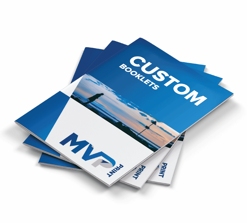
MVP Print’s Approach to Magazine Prints
At MVP Print, our magazine print services stand out. We merge creativity with functionality for striking publications. Our goal is to meet client needs with unmatched quality in every print job.
Our Design Philosophy
We aim to create magazines that are both visually striking and functional. Our team strives to balance the look with readability. High-quality paper stocks and finishes elevate the appearance and feel of each issue.
Customisation Options
Our customised printing options cater to diverse client needs. We offer paper weights from 100gsm to 170gsm. Binding styles include perfect binding for big magazines and saddle-stitching for smaller ones. Standard sizes are 210mm x 297mm and 148mm x 210mm, with custom sizes available upon request.
Quality Assurance Process in Magazine Prints
Quality is paramount in our operations. Advanced printing technology ensures vibrant colours and clear images. Our team meticulously checks each magazine for errors before printing. We advise using high-resolution images (at least 300 DPI) for superior quality. Our rigorous quality assurance process ensures every magazine meets our high standards.
“MVP Print’s attention to detail and commitment to quality sets them apart in the magazine printing industry.
With MVP Print, you’re not just getting a magazine. You’re getting a publication that embodies your vision and captivates your audience. Our services combine expertise, customisation, and quality assurance for outstanding results every time.
Magazine Prints – A Conclusion
Magazine print design is a captivating art form that balances aesthetics and functionality. From the early days of Caricature Magazine, to modern publications, the core principles remain. Layout, main image, and headline continue to be crucial in engaging readers, just as they were when depicting “Solomon in all his Glory” or “A Cruise to Covent Garden”.
The aesthetic-functional balance in magazine prints involves careful consideration of purpose, content distribution, and visual hierarchy. Typography plays a vital role, with an ideal line length of 50-70 characters ensuring readability. While magazine design can be complex, it becomes more manageable with practice, much like how early psychological tests such as the Thematic Apperception Test (TAT) evolved over time.
As we look towards the print media future, the lessons from historical designs and psychological assessments remind us of the importance of adaptability. Just as a 12-year-old deemed precocious by the TAT later became an art director for Screw magazine, the future of magazine prints lies in embracing change while honouring timeless design principles. This blend of innovation and tradition will shape the engaging, visually stunning publications of tomorrow.